
AI news ·
Adrian Cockcroft warns a single percentile hides real system behavior at P99 CONF
Adrian Cockcroft warns that a single P99 latency figure hides multi-modal behavior, especially when cache hits and misses create distinct peaks. His open-source tool identifies an arbitrary number of peaks in response-time distributions rather than flattening them into one summary statistic.
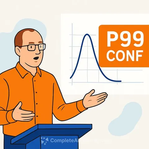
Adrian Cockcroft used his talk at P99 CONF to challenge one of the monitoring world's most comfortable habits: the single percentile. He argued that a lone P99 figure can mask the real story inside a service, especially when latency isn't a smooth curve but a mix of distinct modes.
Cockcroft's approach hasn't changed much since his days at Sun Microsystems. When standard tools gave him little more than vmstat output, he dug into the kernel source to trace where the numbers came from. That work produced two books, Sun Performance and Tuning and Resource Management. The goal was never just to read metrics. It was to understand what the tools were failing to show.
AI as a force multiplier for analysis
Now Cockcroft applies the same instinct with different helpers. Instead of spending hours on custom scripts, he uses AI to build analysis tools quickly. He described the speedup in blunt terms: the code would not have existed otherwise. His latest example is open-source tooling that studies response-time distributions rather than flattening everything into averages and percentiles.
That distinction matters because a single histogram can contain more than one peak. Cockcroft used the cache-hit-versus-cache-miss case as the clean example. The fast path and the slow path stay in place, but their relative heights shift as hit rates change. The average moves. P99 moves. The real system behaviour, though, is just that the mix changed. His tool, written in R with help from ChatGPT, identifies an arbitrary number of peaks and follows how they change over time.
Start wide, then zoom in
His advice to teams was simple: look at the macro view first, then keep digging until the slow request is in focus all the way down. It reflects a career spent with less worship of dashboards and more suspicion of them. Cockcroft's method relies on understanding the shape of the data before trusting any single summary statistic.
For teams building performance analysis skills, this kind of thinking aligns with what's taught in many AI Data Analysis Courses. The core idea is the same: use tools to surface what the raw data actually shows, not just what fits on a slide.
Why this matters for IT and operations teams
Percentile worship is a comforting habit because it fits neatly into a report. Cockcroft's bigger point is the annoying one: if the system has multiple modes, one neat number is often just a decorative lie. The industry keeps buying sharper dashboards when it probably needs sharper questions. For ops teams, that means investing less time in dashboard curation and more time in understanding the actual distribution shapes behind the metrics they report.