Build an HR Training Dashboard in Power BI from Scratch (Video Course)

Turn messy HR data into a professional training dashboard in Power BI. Build a working analytics tool from scratch,no experience needed. Learn data modeling, DAX, and interactive design to track completion rates and uncover insights you can actually use.

Duration: 1 hour
Rating: 5/5 Stars
Beginner Intermediate

Related Certification: Certification in Building HR Training Dashboards with Power BI

Build an HR Training Dashboard in Power BI from Scratch (Video Course)
Access this Course

Also includes Access to All:

700+ AI Courses
700+ Certifications
Personalized AI Learning Plan
6500+ AI Tools (no Ads)
Daily AI News by job industry (no Ads)

Video Course

What You Will Learn

  • Build a production-ready Employee Training Analytics dashboard in Power BI
  • Import and clean the four core tables: Employee, Training, Training Status, and Date
  • Model a star schema and configure correct table relationships
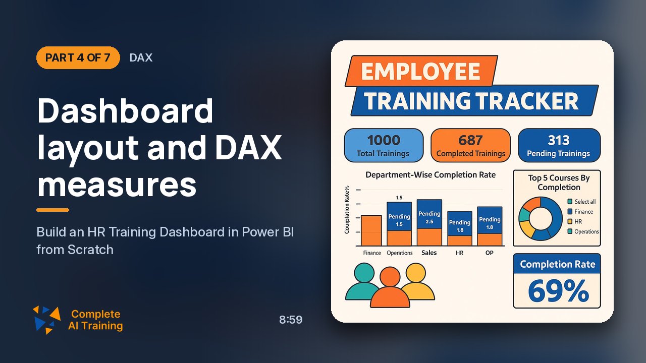
  • Create DAX measures for completion rate, learning hours, and training counts
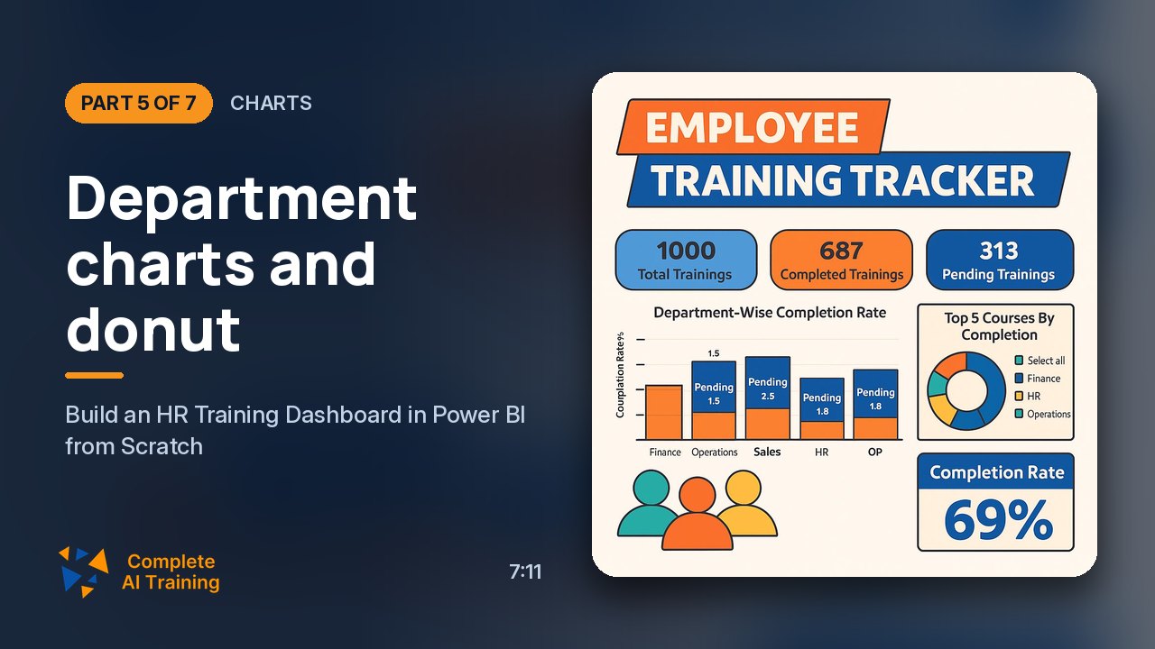
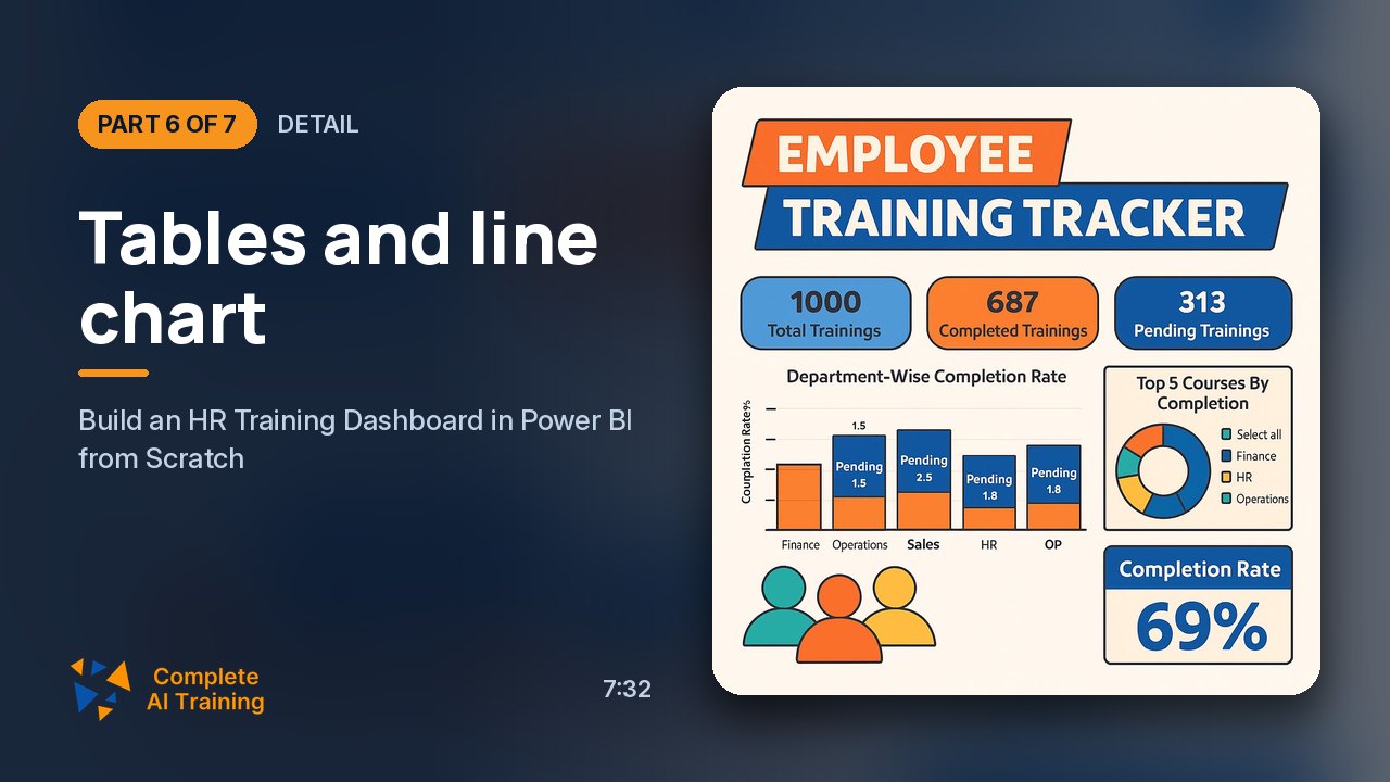
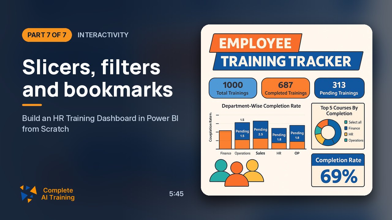
  • Design interactive visuals, slicers, tables, and bookmarks for exploration
  • Test, validate, and apply design best practices for deployment

Study Guide

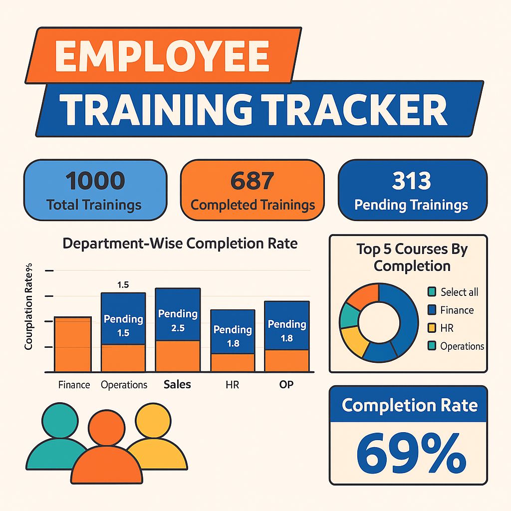
# Employee Training Analytics Dashboard | Power BI HR Project | HR Analytics Tutorial ## Introduction: Why This Course Matters Let me ask you something. Have you ever sat in a meeting where someone asked "how is our training program actually performing?" and the only answer was a shrug and some vague comment about "people seem to be doing okay"? If you work in HR, L&D, or any people-focused role, you've probably lived that awkward moment. The truth is, most organizations spend a fortune on employee training and development, yet they have almost no visibility into whether that investment is paying off. That's where this course comes in. I'm going to walk you through building a complete Employee Training Analytics Dashboard in Power BI, from absolute scratch. No prior Power BI experience needed. We'll take raw, messy HR data and transform it into a professional, interactive dashboard that answers real business questions: Which departments are falling behind on training? What courses are employees actually taking? How many learning hours are we investing? Who needs a nudge to complete their assignments? This isn't just a technical tutorial. It's a complete framework for thinking about HR analytics, data modeling, and dashboard design. By the end, you'll have a production-ready template you can adapt to your own organization, plus the skills to build similar dashboards for hiring, performance, retention, or any other HR domain. Here's what we'll cover: - The four datasets you need and how they connect - Cleaning and transforming data in Power Query Editor - Building a proper star schema data model - Writing DAX measures for key KPIs like completion rate and learning hours - Designing a professional dashboard with cards, charts, tables, and slicers - Adding interactivity with bookmarks and filters Let's get into it. --- ## Section 1: Understanding the Data Foundation Before you open Power BI, you need to understand what data you're working with. The entire dashboard rests on four interconnected tables. Think of them as the raw ingredients for a recipe. If you don't understand what each ingredient does, the final dish won't turn out right. ### The Four Core Tables **Employee Data** , This is your workforce directory. It contains one row per employee with fields like Employee ID, Employee Name, Department, Role, and Joining Date. In our sample dataset, we're working with about 50 employees spread across departments like Finance, Operations, IT, Sales, and HR. **Training Data** , This is your course catalog. Each row represents a training program with a Training ID, Training Name, Category (Technical, Leadership, Soft Skills), Level (Beginner, Intermediate, Advanced), and Duration in hours. This table tells you what training options exist. **Training Status Data** , This is the heart of the dashboard. It's a transaction-level table where each row represents one employee's assignment to one training. It includes Employee ID, Training ID, Assigned Date, Completion Date, Status (Completed or Pending), Learning Hours, and Score. Our sample has about 1,000 of these records. **Date Data** , This is a calendar dimension with Date, Month, Year, Quarter, Week, and Day of Week. It enables time-based analysis. Without it, you can't easily track trends over months or quarters. ### Why Four Tables Instead of One? You might be wondering, why not just dump everything into a single spreadsheet? That's a fair question. The answer comes down to something called normalization. By keeping data in separate tables, you avoid redundancy. The employee's name and department appear once in the Employee table, not repeated in every training record. The training name and category appear once in the Training table. This structure makes the data easier to maintain and update. When someone changes departments, you update one row, not hundreds. It also enables a proper data model. When you connect these tables with relationships, you can ask complex questions like "What's the completion rate for technical trainings in the IT department among managers?" without writing convoluted lookup formulas. --- ## Section 2: Importing Data into Power BI Now let's actually get our hands dirty. The first step in Power BI Desktop is bringing your data in. ### Getting Your Data Launch Power BI Desktop and you'll see a blank canvas. Look for the "Get Data" button in the Home ribbon. Click it, then choose "Excel Workbook" from the list of data sources. Navigate to your Excel file and select it. Power BI will show you a preview of what's in the workbook. You should see the four tables we discussed: Employee Data, Training Data, Training Status Data, and Date Data. Make sure all four are checked, then click "Load." Here's a tip that saves people a lot of headaches: load all the tables at once. If you load them one at a time, you risk Power BI not detecting the relationships between them, and you'll have to build everything manually. Loading everything together gives Power BI the best chance of auto-detecting connections. ### Verifying Your Import After the load completes, look at the Fields pane on the right side of the screen. You should see all four tables listed. Click the arrow next to each one to expand and verify the columns are there. This is a quick sanity check before you move on to transformation. --- ## Section 3: Data Transformation with Power Query Editor Here's something that trips up beginners all the time. You load your data, you start building visuals, and suddenly your dates are showing weird times, or your numbers are being treated as text, or your charts look completely wrong. Nine times out of ten, the problem is data types. Raw data rarely arrives perfectly formatted. Power Query Editor is where you fix that. ### Why Transformation is Non-Negotiable I've seen analysts skip this step and pay for it later. They build an entire dashboard, then discover that the "Completion Date" column includes time components that mess up their month-level aggregations. Or they try to calculate average scores, but the Score column is stored as text so the math doesn't work. The principle is simple: garbage in, garbage out. Time spent cleaning your data at the start saves you hours of debugging at the end. ### The Critical Transformation: Date Fields In our dataset, the most important transformation involves date columns. When Excel stores dates, it often includes both date and time. For our training analytics, we don't care what time of day someone completed a training. We only care about the date. Here's what you need to do: 1. Click "Transform Data" to launch Power Query Editor. 2. Go to the Date Data table. Find the Date column. It's probably showing as "Date/Time" format. Click the column header, go to Data Type, and select "Date." 3. Do the same for Employee Data → Joining Date. 4. Do the same for Training Status Data → Assigned Date. 5. Do the same for Training Status Data → Completion Date. When Power BI asks "Replace current one?" confirm yes. Why does this matter so much? Because when you build time-based visuals, Power BI uses the data type to determine how to group and aggregate. A Date/Time column can cause your monthly charts to show unexpected gaps or duplicate values. Converting to Date ensures clean, predictable behavior. ### Checking Other Data Types While you're in Power Query Editor, take a moment to verify the other columns. Employee IDs and Training IDs should be text or whole numbers. Learning Hours and Score should be decimal or whole numbers. Status should be text. If anything looks wrong, fix it now. Once you're satisfied, click "Close & Apply" to load the cleaned data into your model. --- ## Section 4: Data Modeling and Relationships Now we're getting to the part that separates real Power BI developers from people who just drag and drop charts. The data model. ### Understanding Star Schema vs. Snowflake Schema Let me explain this in plain language. A **star schema** has a central fact table surrounded by dimension tables, like a star. The fact table contains the measurable, transactional data. The dimension tables contain descriptive attributes. In our case, Training Status Data is the fact table. It records every training assignment. Employee Data, Training Data, and Date Data are dimensions that describe who, what, and when. A **snowflake schema** is like a star schema that's been further normalized. Instead of having a single Training dimension table, you might split it into a Training table and a separate Category table. This reduces redundancy but adds complexity. For most Power BI projects, including ours, the star schema is the better choice. It's simpler, faster, and easier to maintain. ### Setting Up Relationships Relationships are what make your dashboard interactive. They allow filters to flow from one table to another. When you select "IT" in a department slicer, Power BI uses the relationships to show only IT-related training records. Here's the relationship structure we need: 1. **Training Status Data → Training Data** via Training ID. This is many-to-one. Each training record in the status table links to one training in the Training Data table. 2. **Training Status Data → Employee Data** via Employee ID. Also many-to-one. Each training assignment links to one employee. 3. **Training Status Data → Date Data** via Assigned Date. Many-to-one. Each training assignment links to one date. To set these up, go to the Model view (the icon that looks like a relationship diagram in the left sidebar). You might see some relationships already auto-created. Verify they're correct. Then create any missing ones. For the Date relationship, click "New Relationship." Select Training Status Data as the first table and Assigned Date as the column. Select Date Data as the second table and Date as the column. Set cardinality to Many-to-One and cross-filter direction to Single. Click Save. ### Why Relationships Matter Imagine you build a chart showing completion rates by department. Without a relationship between Employee Data and Training Status Data, Power BI has no idea which department each training record belongs to. Your chart would be empty or wrong. With the relationships in place, every visual can draw on the full context of the data. Select a department, and all connected visuals update. Select a training category, and the cards recalculate. This is the magic of a well-modeled dataset. --- ## Section 5: Setting Up Your Dashboard Canvas Before we start adding visuals, let's create a consistent foundation. This is what separates a professional-looking dashboard from something that looks like a chaotic collection of charts. ### Choosing a Background We're going with a dark gray theme. Set the page background to 20% gray. This gives the dashboard a modern, polished appearance and makes the visuals pop. To do this, go to the Format tab for the canvas, find the Background section, and set the color. ### Adding a Title Insert a Text Box and type "Training and Learning Tracker Dashboard." Format it with a font size of 20, bold, and centered. Give the text box a background color that contrasts with the page, enable rounded corners, and add a subtle shadow effect. This creates a professional header that anchors the entire page. ### Creating a Measures Table This is a pro move that keeps your model organized. Instead of scattering your DAX measures across different tables, create a dedicated table just for them. Go to the Modeling tab and click "New Table." Name it "DAX Measures." Click Load. You'll see an empty table appear in your Fields pane. From now on, all your measures will live here. Why bother? Because when you have dozens of measures, hunting through multiple tables to find the right one is a nightmare. A dedicated measures table keeps everything in one place and makes it easy to drag measures into visuals. --- ## Section 6: Writing DAX Measures Now we're at the analytical core of the dashboard. DAX, or Data Analysis Expressions, is the formula language Power BI uses for calculations. Think of it as Excel formulas on steroids. ### Total Learning Hours This is the simplest measure. We're just summing up all the learning hours recorded in the Training Status table. Total Learning Hours = SUM('Training Status Data'[Learning Hours]) This tells you the total investment in training across your organization. If you filter by department, it recalculates to show that department's total. ### Total Trainings This counts all training assignment records. Total Trainings = COUNTROWS('Training Status Data') Every row in the status table represents one training assignment. This measure counts them all. ### Completed Trainings This is where things get interesting. We're using the CALCULATE function to modify the filter context. Completed Trainings = CALCULATE( COUNTROWS('Training Status Data'), 'Training Status Data'[Status] = "Completed" ) CALCULATE evaluates the first argument (counting rows) within a modified filter context (only rows where Status equals "Completed"). The result is the number of completed training assignments. ### Pending Trainings Same pattern, different filter. Pending Trainings = CALCULATE( COUNTROWS('Training Status Data'), 'Training Status Data'[Status] = "Pending" ) This counts assignments that are still outstanding. ### Completion Rate This is the percentage of trainings that have been completed. Completion Rate = DIVIDE( [Completed Trainings], [Total Trainings], 0 ) Notice we're using DIVIDE instead of the division operator. This is a best practice. DIVIDE safely handles cases where the denominator is zero, returning the third argument (0) instead of throwing an error. ### Average Learning Hours This gives you the mean learning hours per training record. Average Learning Hours = AVERAGE('Training Status Data'[Learning Hours]) This is useful for benchmarking employee engagement. If the average is low, people might be receiving assignments but not actually spending time on them. ### Understanding Filter Context The key to understanding DAX is grasping filter context. Every measure is calculated within the context of the current filters. When you select "IT" in a department slicer, the filter context changes, and all measures recalculate for the IT department only. CALCULATE is special because it lets you modify the filter context within a measure. That's how we can count only "Completed" records while still respecting the department filter. The department filter comes from the slicer, and the status filter is added by CALCULATE. They work together seamlessly. --- ## Section 7: Building the Dashboard Visualizations Now for the fun part. Let's create the actual visuals that make up the dashboard. ### Summary Cards Cards are the big numbers at the top of the dashboard. They give you an instant pulse on your KPIs. We're creating four cards: 1. **Total Learning Hours** , uses the [Total Learning Hours] measure 2. **Completed Trainings** , uses the [Completed Trainings] measure 3. **Pending Trainings** , uses the [Pending Trainings] measure 4. **Completion Rate** , uses the [Completion Rate] measure For each card, add the measure to the Values field well. Then format it: - Callout value: font size 20, bold, black - Category label: font size 12, bold, black - Background color: consistent with your color scheme - Border and shadow: enabled for a premium feel Here's a design tip: use color consistently. If "Completed" is orange throughout the dashboard, make the Completed card orange. If "Pending" is blue, make the Pending card blue. This creates instant visual recognition. ### Department-wise Completion Rate This is a stacked column chart that shows training performance by department. Insert a Stacked Column Chart. Configure it: - X-axis: Employee Data → Department - Y-axis: Training Status Data → Status (this counts records) - Legend: Training Status Data → Status The result is a chart showing, for each department, a stacked bar with the completed count and pending count. You can immediately see which departments are crushing it and which ones need attention. Format the chart with a title "Department Wise Completion Rate," bold 12pt. Set axis labels to 12pt bold black. Match the legend colors to your card colors. Enable data labels for clarity. ### Top 5 Courses by Completion This donut chart shows which training courses are most utilized. Insert a Donut Chart. Configure: - Legend: Training Data → Training Name - Values: Training Status Data → Training ID Now we need to filter it to show only the top 5. In the Filters pane, drag Training ID to "Filters on this visual." Expand it, select "Top N," and set "Show items" to Top 5. By value, use the count of Training ID. This gives you a quick view of your most popular courses. If you notice that certain high-value leadership courses are rarely taken, that's a signal for your L&D team. ### Employee Training Details Table This is your drill-down table. It provides granular, row-level detail. Insert a Table visual. Add columns in this order: - Employee Name - Department - Training Name - Status - Total Learning Hours - Score Format the table for readability: - Choose a visual style that fits your theme - Set grid color to black - Enable vertical grid lines - Font size 12, bold, black text - Alternate row colors for readability - Bold column headers on a dark background - Enable a totals row with white text on black background Now let's add sparklines for the Learning Hours column. Sparklines are tiny line charts embedded in table cells. They show trends at a glance. Select the Learning Hours column, go to the Sparklines section, and configure it to show the trend across the data. This is a powerful feature for spotting patterns without overwhelming the table. ### Monthly Completion Trends This line chart shows how completions have evolved over time. Insert a Line Chart. Configure: - X-axis: Date Data → Month - Y-axis: [Completed Trainings] measure - Small multiples: Employee Data → Department Small multiples are a game-changer. Instead of one cluttered chart with five lines, you get five separate panels, one per department. This makes it easy to compare trends side by side. You can see if IT completions are rising while Sales completions are flat. Format the chart with a title "Monthly Completion Trends." Enable the shade area with 60% transparency to fill the space under the line. This makes the chart more readable and visually appealing. ### Interactive Slicers Slicers are the controls that let users filter the entire dashboard. **Department Slicer:** Insert a Slicer visual, set the field to Employee Data → Department. Use vertical orientation with a list style. **Role Slicer:** Same setup, but use Employee Data → Role. This lets users filter by job function like Analyst, Associate, Manager, or Lead. **Status Slicer:** Set the field to Training Status Data → Status. Use a dropdown style for compactness. **Training Name Slicer:** Set the field to Training Data → Training Name. Another dropdown for selecting specific courses. Here's the beauty of these slicers combined with your data model. Select "IT" in the department slicer, and every visual updates. The cards show IT's totals. The donut chart shows IT's top courses. The table shows only IT employees. Select "Manager" in the role slicer, and it filters further. The combination of filters gives you unlimited analytical paths. --- ## Section 8: Adding Bookmarks for Better UX Here's a small feature that makes a huge difference in user experience. ### What Bookmarks Do Bookmarks capture the current state of your report page, including filters, slicer positions, and visual states. They let you create navigation buttons that jump to specific views. ### Creating a "Clear All Filters" Button When users explore the dashboard, they'll apply various filters. Eventually, they'll want to reset everything to the default view. That's where our button comes in. First, insert a Button from the Insert tab. Choose a style that fits your design. Format it with the text "Clear All Filters" and appropriate font styling. Next, go to View → Bookmarks → Show Bookmarks Pane. Make sure all filters are cleared and the dashboard is in its default state. Click "Add" to create a bookmark. Rename it to "Clear All Filters." Now select the button. In the Format pane, go to Action. Enable it, set Type to Bookmark, and select the "Clear All Filters" bookmark. Now, whenever a user has applied a bunch of filters and wants to start fresh, they click the button and everything resets. It's a simple interaction that makes your dashboard feel professional and polished. --- ## Section 9: Testing and Validation You're not done just because the visuals look good. You need to verify that everything works correctly. ### Testing Interactivity Go through each slicer and confirm the visuals update as expected: - Select each department in the slicer and confirm the cards, charts, and table all update correctly. - Test the role slicer independently and in combination with the department slicer. - Test the status slicer and verify it propagates correctly to the top courses chart. - Click the "Clear All Filters" button and confirm the dashboard returns to its default state. ### Common Issues to Watch For **Filters not propagating:** If a visual doesn't update when you select a slicer, there's likely a missing relationship or an incorrect cross-filter direction. **Wrong totals:** If your cards show unexpected values, check your DAX measures. A common mistake is using the wrong column in a SUM or COUNT. **Date grouping issues:** If your monthly chart looks wrong, verify that your date columns are properly formatted as Date type. **Performance problems:** If the dashboard feels sluggish, check for unnecessary calculated columns or overly complex measures. --- ## Section 10: Design Best Practices Let me share some principles that will elevate your dashboard from functional to professional. ### Consistent Color Coding Pick a color for each status and stick with it. In our dashboard, orange means Completed and blue means Pending. This convention appears in the cards, the charts, and the table. Users learn the association once and apply it everywhere. ### Typography Hierarchy Use font sizes to create visual hierarchy. Titles at 12pt bold. Card values at 20pt bold. Labels at 12pt bold. This guides the eye to the most important information first. ### Visual Alignment Group related visuals together. Keep consistent margins between elements. Align cards in a row. This creates a sense of order and professionalism. ### Judicious Use of Effects Shadows and rounded corners add polish, but don't overdo it. Apply them consistently across similar elements. Too many different effects makes the dashboard look messy. ### White Text on Dark Backgrounds For table headers and totals rows, use white text on black backgrounds. This creates strong contrast and makes these elements stand out. --- ## Section 11: Key Insights and Takeaways Let's step back and think about what we've built and why it matters. ### The End-to-End Pipeline We followed a structured workflow: import → transform → model → calculate → visualize → refine. Each step builds on the previous one. Skipping or rushing any step compromises the final quality. This workflow applies to almost any BI project, not just training analytics. ### Data Transformation is Non-Negotiable We spent time converting date types and verifying columns. It wasn't glamorous, but it prevented countless downstream issues. Small errors at the transformation stage produce large errors in reporting. ### Model Relationships Drive Everything Without correct relationships, your DAX measures produce misleading results. The star schema with Training Status Data at the center ensures accurate filter propagation across all visuals. ### DAX Measures Enable Dynamic KPIs By placing calculations in reusable measures, we created flexibility and consistency. The same measure can be used in a card, a chart, and a table, and it always calculates correctly based on the current filter context. ### Design Consistency Builds Trust A unified color palette, consistent typography, and careful formatting create a professional dashboard that users trust. When the dashboard looks polished, stakeholders are more confident in the data. --- ## Section 12: Practical Applications and Extensions This dashboard isn't just a classroom exercise. It has real-world applications across multiple domains. ### For HR and L&D Teams - **Identify at-risk departments:** The department-wise chart reveals which business units have disproportionately pending training. Target those teams with interventions. - **Monitor engagement:** Average learning hours per employee shows whether people are actively engaging with training or just receiving assignments. - **Assess course demand:** The top-5 courses chart highlights which programs are most utilized. Use this to guide curriculum investment. - **Individual accountability:** The employee table enables managers to follow up with specific individuals on incomplete training. ### For Business Intelligence Teams The methodology provides a repeatable template. You can adapt the same structure for hiring analytics, performance reviews, retention analysis, or any other HR domain. The combination of star schema modeling with DAX measures demonstrates best practices applicable to numerous projects. ### For Educational Institutions This framework can track student course completion, certificate attainment, and learning journeys. Add dimensions like Instructor, Location, or Cost to support broader institutional reporting. ### Suggested Extensions - **Add a goal-tracking gauge:** Use Power BI's Gauge visual to display completion rate against a target percentage. - **Implement an employee scorecard:** Create a matrix showing each employee's training completion rate across departments. - **Incorporate AI features:** Use the decomposition tree visual to explore factors contributing to low completion rates. - **Schedule automatic refresh:** Configure the dataset to refresh from a shared location on a daily basis. --- ## Section 13: Advanced Considerations Let's talk about taking this to the next level. ### Row-Level Security If you're building this for a large organization, you might want managers to see only their teams' data. Power BI supports Row-Level Security, which restricts data access based on user roles. A manager would log in and automatically see only their department's training data. ### Time Intelligence Our dashboard tracks monthly trends. You could extend this with DAX time intelligence functions like TOTALYTD or SAMEPERIODLASTYEAR to compare performance across periods. ### Custom Visuals Power BI has a marketplace of custom visuals. You might find a specialized chart that better communicates your data, like a radar chart for skills assessment or a treemap for course categories. ### Power BI Service Once your dashboard is built, you can publish it to the Power BI Service. This enables sharing, scheduled refreshes, and mobile access. Your stakeholders can view the dashboard in their browser or on their phone. --- ## Section 14: Common Mistakes and How to Avoid Them Let me save you some pain by highlighting mistakes I see all the time. ### Skipping Data Validation People get excited and want to see visuals immediately. They skip the Power Query transformation step. Then they wonder why their dates are wrong or their numbers don't add up. Always validate your data types before building visuals. ### Ignoring Relationships Some people build visuals without checking the relationships. They get strange results and don't understand why. The data model is the foundation. Get it right first. ### Hard-Coding Values in Visuals Instead of creating measures, some people type values directly into visual configurations. This makes the dashboard inflexible and hard to maintain. Always create measures for calculations. ### Inconsistent Formatting One chart has blue bars, another has green bars for the same metric. One card is dark, another is light. This creates confusion. Establish a formatting guide and stick to it. ### Overcomplicating the Design Too many colors, too many effects, too many visuals crammed onto one page. The dashboard becomes overwhelming and hard to read. Simplicity and clarity should be your goals. --- ## Conclusion: Turning Data into Action We've covered a lot of ground. Let me wrap this up with some final thoughts. Building an Employee Training Analytics Dashboard in Power BI is about more than just learning a tool. It's about developing a mindset. A mindset that says data should drive decisions. A mindset that says every training dollar should be accounted for. A mindset that says HR is not just a cost center, but a strategic function that can be measured and optimized. The skills you've learned here , importing and transforming data, building a star schema model, writing DAX measures, designing interactive visuals , are transferable. You can apply them to any analytical challenge. The specific dashboard we built is just one example. Here's what I want you to do next. Take this framework and apply it to your own data. Maybe you don't have training data. Use it for employee engagement surveys. Use it for sales pipeline analysis. Use it for any domain where you need to track progress, identify trends, and drive action. The organizations that thrive are the ones that make decisions based on evidence, not intuition. Tools like Power BI make that possible. But the tool is only as good as the person using it. The methodology, the attention to detail, the understanding of data modeling , that's what separates a chart-maker from an analyst. You now have the knowledge to build dashboards that genuinely help people. Dashboards that reveal hidden problems and opportunities. Dashboards that empower HR teams to invest in training that actually works. Go build something useful.

Frequently Asked Questions

# FAQ: Employee Training Analytics Dashboard with Power BI

This FAQ serves as a complete reference for building an Employee Training Analytics Dashboard in Power BI. It answers questions about data preparation, modeling, DAX calculations, visualization design, and interactive features. Whether you are starting your first HR analytics project or looking to refine your Power BI workflow, the answers here address the practical challenges you will encounter at each stage of development.

Getting Started

What is the purpose of a Training and Learning Tracker Dashboard?

The Training and Learning Tracker Dashboard provides a centralized visual overview of an organization's employee training program. Its primary objectives include:

Monitoring completion rates: Quickly identify what percentage of assigned training has been completed versus pending.
Tracking learning investment: Calculate total learning hours consumed across the organization.
Identifying gaps: Determine which departments, roles, or individuals have incomplete training assignments.
Spotlighting popular courses: Highlight the top courses by completion count.
Trend analysis: Understand how training completion patterns evolve month by month across departments.

The dashboard transforms raw training data into actionable intelligence, helping HR teams answer questions like "Which department has the lowest completion rate?" or "What is the average learning hours per employee?"

Who would typically use this type of dashboard?

This dashboard serves multiple stakeholder groups:

HR Managers: To oversee the training program holistically, identify departments needing intervention, and report on training metrics to leadership.
Learning and Development (L&D) Teams: To assess which courses are most effective and identify gaps in training coverage.
Department Heads: To monitor their team's training compliance and ensure required certifications are completed.
Executives: To evaluate the return on training investments and align development programs with organizational goals.
Power BI Developers: As a template for building similar HR analytics solutions.

What are the main learning objectives when building this dashboard?

Building this dashboard develops a complete Power BI skill set. You will learn to import and prepare HR datasets from Excel, transform raw data using Power Query Editor, and design a data model with appropriate relationships. You will also write DAX measures for key metrics like completion rates and training hours, construct a professional layout with cards, charts, and tables, and implement interactive features such as slicers and bookmarks. The project also reinforces design best practices around color consistency, typography, and layout organization that apply to any BI project.

What level of Power BI experience do I need before starting?

A basic familiarity with Power BI Desktop is helpful but not required. You should understand how to open a report, navigate the Fields pane, and recognize the difference between the Report, Data, and Model views. No prior DAX knowledge is needed,the project walks through each measure step by step. If you have never used Power BI before, spend a few hours exploring the interface and loading a simple Excel file first. That foundational comfort will make the workflow in this project much smoother.

Data Preparation and Understanding

What datasets are required to build this dashboard?

Four interconnected tables form the foundation:

Employee Data (approximately 50 rows) contains Employee ID, Employee Name, Department, Role, and Joining Date.
Training Data includes Training ID, Training Name, Category (Technical, Leadership, Soft Skills), Level (Advanced, Intermediate, Beginner), and Duration in hours.
Training Status Data (approximately 100 rows) records Employee ID, Training ID, Assigned Date, Completion Date, Status (Completed/Pending), Learning Hours, and Score.
Date Data provides Date, Month, Year, Quarter, Week, and Day of Week for time-based analysis.

These tables must share common keys (Employee ID, Training ID, Date) to enable relationship building in the data model.

How should the data be structured in Excel before importing?

For seamless Power BI integration, follow these guidelines:

Place each table on a separate worksheet within the same Excel workbook. Use clear, consistent column headers without spaces or special characters where possible. Ensure key columns (Employee ID, Training ID, Date) use identical naming across tables. Avoid merged cells, pivot table formats, or subtotal rows within data ranges. Maintain consistent data types within each column,all dates in a date format, all scores as numbers. Verify referential integrity,every Training Status record should reference valid Employee IDs and Training IDs.

What is the role of Power Query in this project?

Power Query serves as the data transformation layer. After importing data, it enables you to validate and correct data types,for example, converting DateTime fields that only contain dates into proper Date types. It also lets you inspect data quality by identifying nulls, duplicates, or inconsistent values, clean data by removing unnecessary columns or filtering rows as needed, and standardize formats so dates, numbers, and text fields are consistently formatted. The transformation step is critical because incorrect data types can cause calculations to fail or return unexpected results. If a date column remains as DateTime when only a date is needed, it may interfere with date-based relationships and time intelligence calculations.

Why is checking and correcting data types essential before building the model?

Data types fundamentally determine what operations Power BI can perform. Common issues include a DateTime format on a date-only column causing time-of-day values (00:00:00) to appear unnecessarily in visuals, text-stored numbers that cannot be used in SUM or AVERAGE calculations without conversion, and incorrect date types that prevent date relationships or time intelligence functions from working properly. By clicking Transform Data after import and correcting data types in Power Query Editor, you ensure that columns behave predictably in calculations, relationships, and visualizations. This step is a recommended best practice in every Power BI project.

How do I handle missing or null values in the training data?

Missing values typically appear in the Completion Date column when a training is still pending, or in the Score column when an assessment has not been taken. The approach depends on the column's role. For Completion Date, a blank value is meaningful,it signals a pending training,so you should leave it as is. For Score, you may choose to leave blanks or replace them with a default value like 0, but be aware that replacing blanks with 0 will skew average score calculations. In Power Query, you can use the Replace Values feature or a conditional column to handle nulls. The key is to decide deliberately rather than letting nulls silently affect your measures.

What should I do if I have duplicate records in the training status data?

Duplicate records can inflate your counts and distort completion rates. In Power Query Editor, select the relevant columns (Employee ID, Training ID, Assigned Date) and use the Remove Duplicates option. However, before removing anything, determine whether the duplicates are true duplicates or legitimate multiple assignments of the same training to the same employee at different times. If an employee was assigned the same training twice in different quarters, those are valid records. Only remove rows where every field is identical across all columns. If you are unsure, keep the records and add a unique identifier column instead.

Data Modeling and Relationships

What relationships are established in the data model?

The dashboard uses four key relationships:

Training Status → Employee Data: Linked on Employee ID (many-to-one).
Training Status → Training Data: Linked on Training ID (many-to-one).
Training Status → Date Data: Linked on Assigned Date to Date (many-to-one).
Completion Date to Date Data: An optional additional relationship using the Completion Date field.

These relationships allow the visualizations to pull department names from Employee data, course details from Training data, and time-based fields from Date data,all filtered through Training Status records.

What are star schemas and snowflake schemas, and which does this model use?

Star Schema: A central fact table (Training Status) surrounded by dimension tables (Employee, Training, Date), with all relationships radiating outward from the center.
Snowflake Schema: A more normalized structure where dimension tables are further split into sub-dimensions,for example, Employee Data split into separate Department and Role tables.

The dashboard uses a star schema configuration. Training Status Data serves as the central fact table containing measurable values like Learning Hours and Score, while Employee Data, Training Data, and Date Data function as dimension tables. This structure is preferred for its simplicity, query performance, and ease of use in Power BI.

Why is it necessary to create relationships, and what happens if they are missing?

Without relationships, Power BI cannot correctly filter or aggregate data across tables. For example, you could not show "Department-wise completion rates" because the Department field from Employee Data could not connect to Status from Training Status. Total learning hours would not reflect course-level grouping, and time-based analysis using the Date table would be impossible. Power BI automatically detects some relationships during import, as seen with Training ID and Employee ID, but manual relationships,such as connecting Assigned Date to the Date table,must be established explicitly in the Model view.

What cardinality should I use for the relationships and why?

The relationships in this model are all many-to-one. Training Status Data contains many records per employee and many records per training, so it connects to Employee Data and Training Data as the "many" side. The Date Data table connects to Training Status Data on Assigned Date, also as a one-to-many relationship. This cardinality is correct because each employee appears once in Employee Data but can have multiple training records. Using one-to-one or many-to-many cardinality here would either be inaccurate or create unnecessary model complexity. The cross-filter direction should be set to Single for all relationships to prevent ambiguous filter propagation.

How do I troubleshoot relationship errors in Power BI?

Common relationship errors include duplicate values in key columns, mismatched data types between related columns, and inactive relationships that cause unexpected behavior. To troubleshoot, start in the Model view and check the cardinality and cross-filter direction of each relationship. If a relationship fails to create, look for duplicate values in the dimension table's key column,Power BI requires unique values on the "one" side. If dates are not matching, verify that both columns are formatted as Date and not DateTime. You can also use the Manage Relationships dialog to see all relationships at once and identify which ones are inactive or incorrectly configured.

What is the role of the Date table in time intelligence?

The Date table enables time-based analysis by providing a continuous set of dates that can be used for grouping, filtering, and time intelligence calculations. In this dashboard, the Date table allows you to analyze monthly completion trends, compare performance across quarters, and calculate metrics like month-over-month changes. Without a dedicated Date table, you would be limited to whatever date fields exist in your fact table, which often have gaps and cannot support functions like TOTALYTD or SAMEPERIODLASTYEAR. The Date table connects to Training Status Data through the Assigned Date field, creating a clean path for time-based filtering.

DAX Measures and Calculations

What DAX measures are essential for this dashboard, and what do they calculate?

Seven core DAX measures power the dashboard:

Total Learning Hours: Total Learning Hours = SUM('Training Status'[Learning Hours]) , Sums all learning hours recorded across all training status records.
Total Trainings: Total Trainings = COUNTROWS('Training Status') , Counts the total number of training assignment records.
Pending Trainings: Pending Trainings = CALCULATE(COUNTROWS('Training Status'), 'Training Status'[Status] = "Pending") , Counts records where the status equals "Pending."
Completed Trainings: Completed Trainings = CALCULATE(COUNTROWS('Training Status'), 'Training Status'[Status] = "Completed") , Counts records marked as "Completed."
Completion Rate: Completion Rate = DIVIDE([Completed Trainings], [Total Trainings], 0) , Calculates the percentage of completed training assignments relative to total assignments, returning 0 if division by zero occurs.
Average Learning Hours: Average Learning Hours = AVERAGE('Training Status'[Learning Hours]) , Returns the average learning hours per training record.

The syntax for measures using CALCULATE with filters is interchangeable with FILTER functions depending on your Power BI version and preferences.

Why use COUNTROWS instead of COUNTA or COUNT?

COUNTROWS is a fundamental DAX function that counts the number of rows in a table after the current filter context is applied. It is preferred over COUNTA,which counts non-blank values in a column,when the goal is to count records regardless of column values. In this dashboard, COUNTROWS('Training Status') gives the total number of assignment records, and the same approach works with CALCULATE for filtered counts. COUNTA would be useful if you needed to count non-null values in a specific column, but for record counting, COUNTROWS is more direct and performant.

How does the DIVIDE function prevent calculation errors?

DAX's DIVIDE function is designed to handle division by zero gracefully:

DIVIDE(Numerator, Denominator, AlternateResult)

If the Denominator is zero, DIVIDE returns the AlternateResult,0 in the completion rate calculation,instead of raising an error. This is safer than using the / operator, which returns an error for zero denominators. Using DIVIDE ensures the Completion Rate measure never breaks the report even when no training records exist.

What is the difference between a measure and a calculated column?

A measure is a DAX formula that calculates a value dynamically based on the current filter context. It is evaluated at query time and does not consume storage space in the data model. A calculated column is a DAX formula that creates a new column in a table, evaluated row by row at the time the data is loaded, and stored in the model. For this dashboard, all metrics like Total Trainings and Completion Rate should be measures because they need to respond to slicer selections and filter changes. Calculated columns are useful for static categorizations,for example, creating a "Training Year" column from a date field,but they increase model size and should be used sparingly.

What is filter context versus row context in DAX?

Filter context refers to the set of filters applied to the data at the time a measure is evaluated. These filters come from slicers, visual-level filters, page-level filters, and relationships. When you select "Finance" in a Department slicer, every measure on the page is evaluated within that filter context.
Row context refers to the current row being evaluated in a calculation, such as in a calculated column or within an iterator function like SUMX or FILTER. Understanding the distinction is critical because CALCULATE modifies filter context, not row context. In the Pending Trainings measure, CALCULATE evaluates COUNTROWS within a modified filter context where Status equals "Pending."

How do I create a dedicated measures table?

Creating a dedicated measures table keeps your model organized and makes measures easier to find and drag into visuals. In the Modeling tab, click New Table and enter a name like "DAX Measures",Power BI creates an empty table. Click Load, and the table appears in the Fields pane. From that point forward, create all new measures by right-clicking the DAX Measures table and selecting New Measure. The table itself contains no data; it exists solely as a container for your measures. This practice is especially valuable in larger models where measures can become scattered across multiple tables.

Certification

About the Certification

Get certified in Power BI HR dashboard development. You'll have built a working analytics tool from scratch, used DAX for completion tracking, and can now turn messy HR data into interactive dashboards that stakeholders actually use.

Official Certification

Upon successful completion of the "Certification in Building HR Training Dashboards with Power BI", you will receive a verifiable digital certificate. This certificate demonstrates your expertise in the subject matter covered in this course.

Benefits of Certification

  • Enhance your professional credibility and stand out in the job market.
  • Validate your skills and knowledge in cutting-edge AI technologies.
  • Unlock new career opportunities in the rapidly growing AI field.
  • Share your achievement on your resume, LinkedIn, and other professional platforms.

How to complete your certification successfully?

To earn your certification, you’ll need to complete all video lessons, study the guide carefully, and review the FAQ. After that, you’ll be prepared to pass the certification requirements.

Join 20,000+ Professionals, Using AI to transform their Careers

Join professionals who didn’t just adapt, they thrived. You can too, with AI training designed for your job.