Friend's Polarizing AI Pendant: What Product Teams Can Learn
Friend is a $129 AI pendant that promises to "listen, respond, and support" through an always-on mic and a connected app. The pitch: a wearable companion you can talk to all day. The hook: it markets itself as a better "friend" than a human.
The company covered New York City subways with 10,000+ posters, reportedly spending about $1 million. Photos of the ads-and the graffiti on top of them-spread online, pushing the campaign far beyond NYC.
Minimalist black-and-white slogans like "I'll never bail on dinner plans" and "I'll never leave dirty dishes in the sink" implied that constant availability beats human quirks. Many viewed it as an attack on real relationships, sparking a wave of backlash.
The 22-year-old CEO, Avi Schiffmann, added fuel by comparing the AI's role to a religious figure, saying it's like talking to "an omnipresent entity" without judgment. That comparison, reported by Fortune, only intensified criticism.
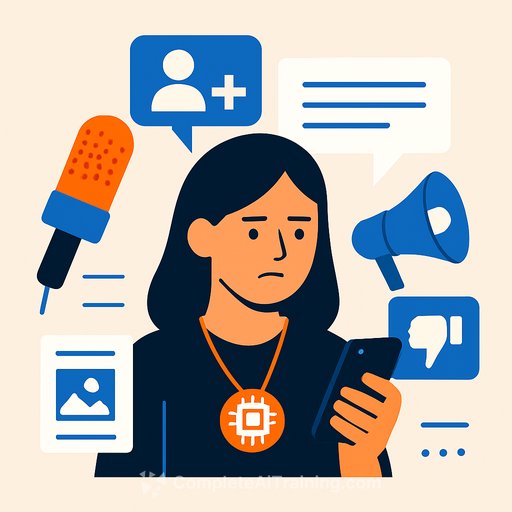
Posters were defaced with "Go make real friends" and "This is surveillance capitalism," channeling broader concerns about privacy and social isolation. Despite the outrage, the company claims the controversy accelerated growth to over 200,000 users-an example of attention-first marketing. As the CEO framed it in a recent podcast, "Traditional marketing is over. Nothing is sacred anymore, everything is ironic."
Key takeaways for product and growth teams
- Provocation works-at a cost. You'll get awareness, but you also choose your critics. Be intentional about the brand you're building.
- Don't insult your customer's identity. Position as augmentation, not a replacement for human bonds. Test copy with diverse panels and a "red team" review.
- Design for privacy perception, not just compliance. Always-on mics trigger "surveillance" alarms. Offer obvious mute controls, clear indicators, on-device processing where possible, and transparent data policies.
- Context is part of the message. Subway ads invite public edits. If vandalism is likely, plan alternates and moderation. OOH needs different guardrails than paid social.
- Measure attention vs. trust. Track CAC, conversion-to-activation, day-30 retention, refund rate, NPS, and sentiment. Attention without retention is a stunt, not a strategy.
- Have a crisis playbook. Prewrite FAQs, escalation paths, and responses to ethical critiques. Speed and consistency beat improvisation.
- Mind the product promise. "Always available" implies reliability, not just clever copy. Battery life, latency, and uptime must support the claim.
- Price-value alignment matters. At $129 for hardware plus an app, bundle benefits, trials, or guarantees to reduce perceived risk.
- Claims that tap religion or therapy carry extra scrutiny. Run legal, clinical, and community reviews before launch.
- Let users define the "jobs to be done." Friendship is broad; focus on narrow, repeatable use cases (anxious moments, reminders, journaling prompts) and build from real usage data.
A quick stress-test for edgy campaigns
- Boundary: Define what you will and won't joke about (grief, religion, mental health, children).
- Hypothesis: Write the behavior change you expect (and how you'll measure it).
- Guardrails: Add privacy copy, disclaimers, and clear product screenshots-not just provocation.
- Adversarial review: Give critics the first pass. If they can wreck it, they will.
- Scenario map: If X goes viral, we do Y (budget reallocation, PR response, product updates).
- Pilot first: Test in a smaller market or digital-only for one week.
- Kill switch: Know the thresholds to pause, pivot, or pull.
Build substance under the spectacle
- Core UX: Fast wake word, clear LED/mute state, granular permissions, and an obvious "off."
- Latency and reliability: Sub-500ms perceived response for simple queries. Degrade gracefully offline.
- Privacy by design: On-device processing for wake word, minimal retention, and user-facing deletion controls.
- Safety: Guard against parasocial dependence. Provide boundaries, session limits, and resources for support when needed.
- Voice and tone: Warm, useful, and concise-no pretending to be human. Avoid making clinical or spiritual claims.
- Activation: A 3-minute setup that teaches 3 high-value daily use cases and schedules a follow-up nudge.
Judge success by daily active minutes, streaks, repeat prompts, and qualitative diaries-not just installs. If utility is real, retention will tell you. If not, the loudest ad only shortens the path to churn.
Final thought
Attention can open the door, but product truth keeps people in the room. If you're going to provoke, earn it with a device, experience, and policy stack that stands up to scrutiny.
Resources
- CEO's "AI as God" interview coverage: Fortune
- Build your team's AI product skills: Complete AI Training - courses by job
Your membership also unlocks: