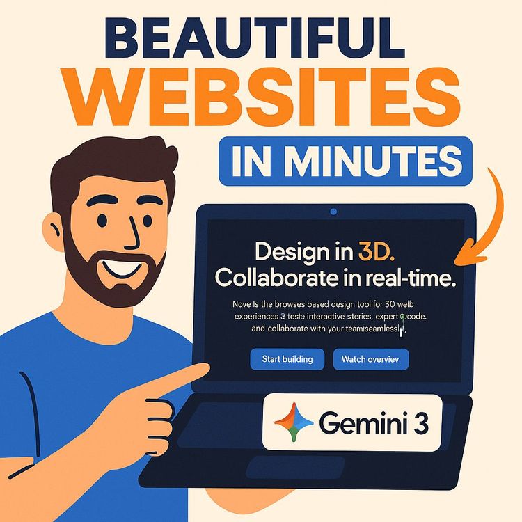
Gemini 3 Tutorial: Build $5,000+ AI Websites in Minutes (Video Course)
Learn my fast, visual-first workflow for building premium, on-brand sites with Gemini 3. Curate references, write composite prompts, and add polish,animations, micro-interactions, bento layouts,to ship $5k+ landing pages in minutes. Yes, really.
Related Certification: Certification in Designing and Building Client-Ready AI Websites with Gemini 3
Also includes Access to All:
What You Will Learn
- Use Gemini 3 for vibe designing to produce production-grade landing pages
- Write composite prompts that combine brand assets, visual references, and sections
- Assemble mood boards and a design lexicon to precisely steer AI aesthetics
- Iteratively refine layouts in a hybrid editor without full re-generation
- Add advanced polish-animations, micro-interactions, and bento layouts-to command $5,000+ pricing
Study Guide
How I Build Beautiful $5,000+ Websites in Minutes with AI (Gemini 3 Tutorial)
The old way of building websites is slow and expensive: endless calls, mood boards in five different tools, and weeks of iterations that still produce something that feels… fine. The new way flips the entire process. You curate the aesthetic, feed AI visual and brand ingredients, and direct it like a film producer. The result: premium, on-brand landing pages in minutes that clients gladly pay $5,000+ for,because it looks handcrafted, converts, and elevates their brand.
This course walks you through that method step by step. You'll learn how to guide Gemini 3 (Google's multimodal AI) to generate production-grade websites by "vibe coding",giving it images, brand assets, and precise design vocabulary so it learns your taste and builds accordingly. You'll master the composite prompt, iterative refinement, and advanced polish (animations, micro-interactions, and layout upgrades) that make the difference between a template and a premium product.
Most people ask AI to "build a landing page," then wonder why they get a generic result. This course fixes that. You'll see exactly how to feed the model references, articulate the aesthetic, and refine the output without redoing the whole thing. If you want to deliver high-end sites faster, use this as your playbook.
What You Will Learn
By the end, you will be able to:
1. Understand vibe designing and how Gemini 3 turns your visual inputs into quality code and layouts.
2. Build composite prompts that fuse business goals, brand identity, and visual references.
3. Create and use a personal design lexicon that lets you speak to AI with precision.
4. Assemble mood boards from the right places (Mobin, Dribbble, Behance) that drive exact results.
5. Generate, refine, and polish a high-converting landing page, section by section.
6. Layer in advanced elements,animations, bento layouts, scroll reveals,that signal craftsmanship and justify premium pricing.
7. Package and deliver $5,000+ websites quickly for clients, your startup, or internal teams.
The New Paradigm: Vibe Designing with Gemini 3
Vibe designing (or vibe coding) is an iterative, visual-first workflow. Instead of hard-coding every pixel, you direct the AI like an art director. You give it images that represent the vibe, brand tokens (colors, fonts, logo), and design vocabulary (hero, bento grid, glassmorphism). Gemini 3 understands both text and images, so when you attach a screenshot of a website you love, it learns spacing, layout, type hierarchy, and atmosphere,not just colors and shapes.
Two truths anchor this approach:
1. Quality in, quality out. Poor prompts produce generic layouts.
2. Visual inputs outperform text. A single screenshot can drive better output than paragraphs of description.
And a reminder worth framing: "You want AI to cook, but you have to give AI the ingredients to cook properly. And once you bring all of these ingredients, then you can reference them to get the best result possible."
The Challenge: Why Generic AI Outputs Happen
Most first-time prompts are vague. The model fills gaps with defaults: safe layouts, forgettable colors, and stock-feeling imagery. It's functional, but it won't convert or impress.
Example 1 , Flawed Prompt:
"Build a landing page for my AI consulting business called Morningside."
Likely result: A bland hero, generic icons, random blue buttons, and stock photos. Nothing about "Morningside" is captured.
Example 2 , Flawed Prompt:
"Create a site for a SaaS analytics tool."
Likely result: Overused gradient, three columns of generic features, a CTA that reads "Get Started," and a footer with no identity. It technically works; it emotionally misses.
When the inputs are thin, AI guesses. Your job is to remove guesswork by giving it taste, not just tasks.
The Core Principle: Advanced Prompt Engineering (with Visuals)
The difference between an ordinary and a premium site is the prompt architecture. Think "composite prompt": combine text details, brand assets, stylistic references, and at least one visual reference. Gemini 3 excels when you show it what to create, not just tell it.
Why Visual Inputs Are Non-Negotiable
Visual references communicate layout rhythm, hierarchy, whitespace, and vibe that text can't. Gemini 3 reads the screenshot and maps your output to similar structure and feel.
Example 1 , Minimal Aesthetic Reference:
Attach a screenshot of a simple, elegant product page with large type, generous whitespace, and subtle gradients. Prompt: "Use this for spacing and typography. Keep it minimalist and premium. Avoid heavy borders. Focus on type scale." Result: A calm, high-end layout.
Example 2 , Futuristic Fintech Reference:
Attach a dark, neon-accented dashboard UI with glassmorphism cards. Prompt: "Use this for card styling, glows, and glassmorphism. Keep the palette charcoal with cyan highlights." Result: A sleek, modern, high-contrast site.
Stylistic Referencing: Tap Into Established Design DNA
Referencing well-known sites gives the model a target for rhythm and tone.
Example 1:
"In the style of linear.app. Dark mode. Crisp typography. Sparse, clean UI. Emphasize functional elegance."
Example 2:
"Use the minimalist aesthetic of apple.com. Large imagery, restrained type, confident whitespace. No clutter."
These references calibrate spacing, proportions, and tone in a way that generic "clean, modern" never does.
Brand Identity: Make the Output Yours
Give Gemini the ingredients that make the site bespoke: brand name, positioning line, target audience, color palette (hex codes), logo, and copy direction.
Example 1 , SaaS (B2B):
Brand: OutreachX. Positioning: "Your AI SDR that books meetings while you sleep." Audience: AI agencies and tech founders. Colors: #0B0F19 (background), #6C7CFF and #7A3BFF (accents). Tone: confident, technical, no fluff. Logo: attached.
Example 2 , Luxury Restaurant:
Brand: Stone & Ember. Positioning: "Seasonal tasting menu over open flame." Audience: high-end locals, food tourists. Colors: #161616, #C2A26D, #EDE8DF. Tone: refined, sensory, poetic. Logo: attached.
Use a Design Lexicon to Direct with Precision
Speak the model's language. Specific terms reduce ambiguity and increase control.
- Layouts: Hero section, Bento layout, Three-column, Split screen, Full-bleed section.
- Styles: Dark mode, Flat design, Glassmorphism, Futuristic, Minimalist.
- Components: Call to Action (CTA), Testimonial section, Social proof, FAQ, Footer, Pricing cards, Feature grid.
Example 1 , Precise Request:
"Create a hero with a split-screen layout: left side headline + subhead + primary CTA, right side product mockup. Dark mode with glassmorphism card under the CTA for secondary links."
Example 2 , Feature Area:
"Add a bento layout with 5 tiles: 1 large feature on the left, 4 small tiles on the right. Each tile has an icon, 2-line headline, and a 1-line benefit."
The AI Web Design Workflow: From Zero to Premium in Minutes
This is the repeatable system that compresses the project into a focused session. Follow it exactly at first. Iterate once you internalize the pattern.
Step 1: Discovery & Mood Boarding
First, define the aesthetic and direction with the right inputs. Do this with your client or for yourself to avoid rework later.
- Understand the business: What is it? Who is it for? What's the core promise?
- Gather inspiration: Dribbble (concepts), Behance (portfolios), Mobin (screenshots of real apps/sites). Screenshot what feels right,even if the content is unrelated. We care about vibe, not topics.
- Define key visuals: Style (futuristic vs minimalist), color palette (dark vs light), typography (sans vs serif), motion (subtle vs energized).
- Save 3-7 references. Too few and the output drifts; too many and it becomes noisy.
Example 1 , Startup SaaS Mood Board:
3 screenshots from linear.app, 2 Mobin shots of dashboard cards, 1 Dribbble animation of a glowing CTA. Notes: "Dark mode, crisp type, cyan/purple accents, minimal borders."
Example 2 , Hospitality Mood Board:
1 Behance case study of a luxe restaurant site, 2 photography-led homepages with full-bleed imagery, 1 narrow serif typography reference, 1 Mobin screenshot with elegant menu layout. Notes: "Moody photography, gold accents, soft scroll reveals."
Step 2: Initial Generation with a Composite Prompt
Combine brand details, audience, color palette, key copy, stylistic references, and 1-2 primary screenshots. Ask Gemini 3 to produce a multi-section landing page.
Example 1 , Composite Prompt (SaaS):
"Create a high-converting landing page for OutreachX, an AI Sales Development Rep for AI agencies. Audience: founders and growth leaders. Tone: technical and confident. Use dark mode with #0B0F19 background, gradients from #6C7CFF to #7A3BFF, and subtle glows. Reference the attached screenshots for layout and spacing (linear-style minimalism). Sections: hero, social proof (client logos), bento features (5 tiles), process (3 steps), pricing (3 tiers), testimonials, FAQ, footer. Include a split-screen hero: left side headline 'Meetings on autopilot,' right side animated mockup section placeholder. Use a primary CTA 'Book A Demo'."
Example 2 , Composite Prompt (Restaurant):
"Design a premium homepage for Stone & Ember, a wood-fired tasting menu experience. Audience: high-end locals and visitors. Tone: refined, sensory, minimal. Colors: #161616 background, #C2A26D accents, #EDE8DF for text. Use attached screenshots for full-bleed hero, typography scale, and elegant spacing. Sections: hero with full-bleed image + headline overlay, chef's story, seasonal menu (3 rotating highlights), gallery with subtle parallax, reservations module, testimonials, location/map, footer with hours and policies. Primary CTA: 'Reserve A Table'."
Attach the most representative screenshot. If you have multiple, specify which screenshot should drive which section.
Step 3: Iterative Refinement and "Vibe Design"
Do not regenerate the entire page for small changes. That's how people waste time and lose control. Use a hybrid editor (for example, a tool like a.build or a similar environment that blends AI with a visual editor) to make precise adjustments.
- Tweak fonts: swap families and adjust weights for hierarchy.
- Adjust color tokens: background, accents, button states, overlays.
- Swap imagery: backgrounds, product shots, and illustrations.
- Edit copy: replace placeholders with brand voice.
- Add/Remove components: pricing tables, FAQs, or feature tiles as needed.
Example 1 , Micro Adjustments:
Change the hero headline size up two steps; increase line-height for subhead; convert CTA from outline to solid with a glow hover; reduce section padding by 8px on mobile.
Example 2 , Section Swaps:
Replace a generic "Features" grid with a 5-tile bento layout; transform a static testimonial row into a horizontal scroll carousel; convert a flat card to glassmorphism with blur and a soft inner shadow.
This hybrid approach is the essence of vibe design,use AI for velocity, and your taste for control.
Step 4: Add Advanced Elements and Animations
This is where $5,000+ work stands out. Subtle motion and micro-interactions signal premium craft.
- Hover effects: beams, glows, magnetic buttons.
- Scroll reveals: fade-up, parallax backgrounds, staggered tiles.
- Ambient motion: gradient shifts, particle fields behind hero headlines, soft card lifts.
- Micro-interactions: accordion FAQs with spring easing, testimonial card flips, callout chips that pulse gently.
Example 1 , CTA Animation:
"Animate the primary CTA with a soft glow beam that sweeps on hover. Keep it under 300ms. On click, show a micro-ripple."
Example 2 , Section Motion:
"Make the bento grid tiles stagger in as you scroll into view. Slight upward motion, 150ms delay between tiles, 400ms duration, ease-out. Keep it subtle."
Core Concepts & Terminology (Quick Primer)
Vibe Designing / Vibe Coding: Visual-first, iterative collaboration with AI to build and refine a website by feel and direction rather than raw code.
Gemini 3: A multimodal AI model that understands text and images together, ideal for generating and editing web pages that match a visual style.
Prompting: Giving instructions that include business purpose, brand assets, stylistic references, and images.
Mood Boarding: Collecting screenshots/images to establish your aesthetic target before generation.
Wireframe: A simple structural layout (not always necessary now, but useful to understand structure you're asking for).
Design Lexicon: Your shared vocabulary with AI,hero section, bento grid, glassmorphism, split hero, etc.,that makes direction unambiguous.
The High-Converting Landing Page: Section-by-Section
Every premium landing page follows a logic. Here's the blueprint and how to prompt each part.
The Hero (Your Biggest Lever)
The hero sets the tone and drives action. Put half your effort here. As the saying goes, "The hero is the most important part of a landing page. You should spend at least 50% of your time on the hero alone because it sets the whole tone."
- Clear headline: communicate the core promise.
- Supportive subhead: clarify who it's for and why it's different.
- Single primary CTA: avoid decision fatigue.
- Visual: product mockup, ambient gradient, or full-bleed photo that reinforces the message.
- Optional social proof badges just under the CTA.
Example 1 , SaaS Hero:
Headline: "Meetings on autopilot." Subhead: "An AI SDR that fills your calendar while you sleep." CTA: "Book A Demo." Visual: rotating mockups of inbox sequences and calendar slots with subtle glow.
Example 2 , Restaurant Hero:
Headline: "Fire, flavor, and a seasonal story." Subhead: "A tasting menu over open flame." CTA: "Reserve A Table." Visual: slow-motion flame over cast iron, dark overlay, gold accent line.
Social Proof
Logos, testimonials, numbers. Keep it clean and credible.
- Client logos in muted grayscale.
- One-line testimonials with names and roles.
- Metrics ("4.9/5 average rating," "2,000+ active users").
Example 1:
"Trusted by teams at Acme, Nova, Flux, and Vector." Logos in a quiet strip under the hero.
Example 2:
"'We doubled meetings in 30 days.' , Mia, Growth Lead." Small avatar, short endorsement.
Features (Explain Benefits, Not Just Stuff)
Translate features into outcomes. Use a bento or grid for rhythm.
- Headlines that state outcomes ("Never miss a warm lead").
- One-line descriptions.
- Icons or micro-illustrations.
Example 1 , Bento Grid:
5 tiles: Auto-Prospecting, Smart Sequencing, Live Inbox, Team Dashboards, Calendar Sync. Each with a crisp icon and one-line benefit.
Example 2 , Three-Column Grid:
Three core benefits: Speed, Simplicity, Scale. Each with a sentence and small graphic.
Process / How It Works
Show the path from "not using it" to "using it." Make it feel easy.
- 3-4 steps with icons or small visuals.
- One-liners under each step.
Example 1 , SaaS:
1) Connect accounts. 2) Choose targets. 3) Let the AI run. 4) Review booked calls.
Example 2 , Restaurant:
1) Pick a date. 2) Choose your experience. 3) Arrive hungry. 4) Let us surprise you.
Pricing
Clear, simple tiers with a highlighted "most popular" option.
- 2-3 tiers, each with a headline, price, and included benefits.
- Annual toggle if applicable.
- CTA and link to "Talk to sales" if price is higher-touch.
Example 1 , SaaS:
Starter, Growth (highlighted), Enterprise. Each with a clear value proposition and a top-line metric like "Up to 2 seats."
Example 2 , Restaurant:
Tasting Menu (price per person), Chef's Counter (limited seats), Private Dining (inquire).
FAQ
Remove friction. Answer objections before they arise.
- 6-8 common questions in an accordion.
- Crisp answers. No fluff.
- Link to learn more or booking.
Example 1 , SaaS FAQs:
"Does this replace my SDR?" "Is my data secure?" "How fast can we start?"
Example 2 , Restaurant FAQs:
"Do you accommodate allergies?" "Is there a dress code?" "Where do we park?"
Footer
Navigation, contact, social, legal. Clean and small. Avoid clutter.
Example 1:
Columns for Product, Company, Resources, Legal. Newsletter field optional.
Example 2:
For hospitality: hours, address, phone, booking link, gift cards, policies.
Case Study 1: Building a SaaS Landing Page (OutreachX)
Goal: A premium, dark-mode, conversion-focused site for an AI SDR product for agencies.
Step A , Mood Board: Pull 3 linear.app screenshots (type and spacing), 2 Mobin dashboard cards (glassmorphism), 1 Dribbble CTA hover animation (glow beam). Notes: "Minimal, confident, technical."
Step B , Composite Prompt: See earlier example. Attach the most representative screenshot for layout and spacing.
Step C , Initial Generation: Gemini 3 returns a full landing page. Expect a usable hero, a basic social proof bar, feature grid, process, pricing, testimonial row, FAQ, footer.
Step D , Vibe Refinements:
- Boost hero type scale by +10%.
- Darken background to #0B0F19, add subtle gradient overlay at the top.
- Turn features into a 5-tile bento, staggered reveal on scroll.
- Convert CTA to beam hover with short easing.
- Adjust testimonials to a 3-card carousel with auto-scroll.
Step E , Advanced Polish:
- Add subtle particle field behind the hero header (very light density).
- Animate dashboard mockup on scroll (soft parallax).
- Tighten mobile spacing; raise CTA above the fold on mobile.
Example Prompt to Gemini 3 for a Specific Upgrade:
"Replace the standard feature grid with a bento layout (1 large + 4 small tiles). Use glassmorphism for the large tile: frosted background with 16px blur, 1px inner border with 20% white. Add a subtle glow on hover."
Another Example Prompt:
"Add a particle effect behind the hero headline with 10% opacity, slow movement, and no interaction. Keep performance lightweight."
Case Study 2: Building a Restaurant Homepage (Stone & Ember)
Goal: A moody, elegant site with full-bleed photography and minimal copy, built to convert to reservations.
Step A , Mood Board: 1 Behance case study with luxe typography, 2 full-bleed photography homepages, 1 narrow serif reference, 1 Mobin menu layout screenshot. Notes: "Gold accents, dark backgrounds, soft scroll reveals."
Step B , Composite Prompt: See earlier restaurant prompt. Attach the photo-forward screenshots to govern spacing and type rhythm.
Step C , Initial Generation: Expect a strong hero with imagery, headline overlay, and centered CTA. Secondary sections that tell the story and direct to booking.
Step D , Vibe Refinements:
- Increase overlay contrast on the hero image for headline readability.
- Switch body font to a serif for headlines and a modern sans for body.
- Add a gallery section with parallax and gentle fade-in.
- Place reservation module above the fold on mobile.
Step E , Advanced Polish:
- Animate gold accent lines as you scroll (subtle draw-on effect).
- Add a micro-interaction to the booking button (soft pulse every 10 seconds).
- Optimize images for performance; lazy-load gallery.
Example Prompt for Typography:
"Set H1 in a refined serif with tight tracking, H2 in a semi-serif, and body in a geometric sans. Increase H1 size by 12%, add 2px gold underline accent on hover."
Example Prompt for Gallery Motion:
"Create a 3-row mosaic gallery with subtle parallax: each row scrolls at a slightly different speed. Fade images in at 15% viewport visibility."
Case Study 3: Turning a Generic Brief into a Premium Page (Morningside)
Many clients show up with the generic prompt. Here's how to turn it into a high-end site.
Original: "Build a landing page for my AI consulting business called Morningside." Output would be uninspired. Here's the fix.
Step A , Clarify Identity: Industry focus? Offer depth? Audience? Colors? Copy? Gather a logo or mark if available.
Step B , Mood Board: 2 screenshots of premium consulting sites (minimal, confident type), 1 case-study layout reference, 1 editorial-style typography screenshot.
Step C , Composite Prompt:
Example , Upgraded Prompt:
"Create a minimalist landing page for Morningside, an AI consulting firm for enterprise leaders. Tone: executive, analytical, calm. Colors: white (#FFFFFF), off-black (#0E0E0E), muted blue accent (#2B6CB0). Reference attached screenshots for layout and type (editorial feel). Sections: hero with split layout (headline + executive photo), case studies (3 cards with metrics), services overview (3 columns), client logos, thought leadership (2 articles), contact CTA, footer. Keep motion subtle."
Step D , Vibe Refinements: Upgrade case study cards with "Results" metrics; add a short "Method" section with a 3-step process; make CTA "Schedule A Strategy Call."
Step E , Advanced Polish: Add a soft underline animation on links; use a sticky top nav with a clean scroll shrink; incorporate a quiet, high-end hover effect on case study cards.
Tooling Stack That Accelerates Everything
- Gemini 3 via Google AI Studio: Use for multimodal prompting, attaching screenshots, and generating structured HTML/CSS (or code components if needed).
- a.build (or similar hybrid tools): Blend generation with visual editing and one-click component swaps/animations.
- v0.dev by Vercel: Generate React components when you need dev-ready pieces.
- Cursor: AI-first code editor if you're scaling complexity or integrating backends.
Example 1 , Fast Path:
Use Gemini 3 to generate a full static landing page, then refine visuals and animations in a.build's editor.
Example 2 , Component Path:
Use Gemini 3 and v0.dev to generate React sections (hero, bento grid), assemble them in a Next.js project, and tweak styles in Cursor.
Actionable Recommendations (Expanded)
1) Develop your design lexicon.
- Keep a running list: hero styles, bento patterns, animation types, typography rules.
- Note what each term actually produces in output.
2) Build a curated reference library.
- Save screenshots from Mobin, Dribbble, and high-quality live sites.
- Tag by style: minimalist, futuristic, editorial, luxury, playful.
3) Adopt an iterative toolset.
- Prefer tools that combine AI generation with precise editing controls.
- Avoid workflows that force full re-prompts for tiny changes.
4) Master the composite prompt.
- Always include brand identity, audience, colors, stylistic references, and at least one visual input.
- Spell out sections and component styles explicitly.
5) Focus on high-impact elements.
- Pour attention into the hero and key animations/micro-interactions.
- Small motions, big perceived quality jump.
Example 1 , Lexicon Card:
"Split hero: left text, right mockup; bento features (1 large + 4 small); glass CTA with beam hover; staggered reveal; logo strip under hero."
Example 2 , Reference Tagging:
"Linear vibe: crisp type, dark mode, understated borders; Apple vibe: bold imagery, low noise, large type; Fintech vibe: glass, neon glow, data visuals."
Best Practices That Keep Output Premium
- One visual reference per section is often enough; too many references create confusion.
- Keep color palette tight (1 background, 1-2 accents, 1 neutral).
- Use contrast and spacing to elevate type; don't cram.
- Limit animations; choose meaningful ones that guide attention.
- Always check mobile. Most traffic hits on smaller screens first.
Example 1 , Color Tokens:
Background: #0B0F19; Text: #E6EAF2; Primary accent: #6C7CFF; Secondary: #7A3BFF; Success: #16A34A; Warning: #F59E0B. Use consistently.
Example 2 , Type Scale:
H1: 48-64px desktop, 32-40px mobile; H2: 32-40px; Body: 16-18px; Buttons: 14-16px. Line-height: 1.3-1.5 for readability.
Common Pitfalls (and How to Fix Them Fast)
- Pitfall: Vague prompts produce generic layouts.
Fix: Use composite prompts with visual references and precise lexicon.
- Pitfall: Over-animated designs feel busy.
Fix: Limit to 2-3 purposeful motions; disable on low-power devices.
- Pitfall: Poor mobile experience.
Fix: Prompt for mobile-first consideration; reduce padding and recalibrate type scales.
- Pitfall: Inconsistent brand tokens (colors, shadows, corners).
Fix: Define tokens once and apply globally; adjust with an editor rather than regenerating.
Example 1 , Rescue Prompt:
"Reduce animations to hover effects only. Remove scroll parallax and keep only fade-up on section entry. Prioritize performance."
Example 2 , Mobile Pass:
"Tighten vertical spacing by 20% on mobile. Increase CTA size by 10%. Ensure hero fits above the fold on 390px width devices."
Pricing and Packaging: Why This Commands $5,000+
Clients pay for outcomes,clarity, conversion, and brand elevation,not raw hours. With this workflow, you compress the timeline without losing craft. As a benchmark, "Most designers charge $5,000 to $10,000 USD for a landing page like this." Deliver speed plus polish and you sit comfortably in that range.
How to structure your offer:
- Discovery and mood board session (short, focused).
- One composite prompt-driven generation.
- Two rounds of vibe refinements in a hybrid editor.
- Final polish: animations, mobile pass, performance adjustments.
- Delivery: static site export or code repo, plus a quick handoff video.
Example 1 , Starter Package:
Single-page landing, one hero animation, three custom sections, delivered in under a week. Price: $5k+.
Example 2 , Premium Package:
Homepage + 2 subpages, enhanced animation suite, multilingual copy placeholders, and a component library. Price: $8k-$12k+ depending on scope.
Implementation: Export, Host, and Optimize
Once the design is locked, get it live quickly and cleanly.
- Export: Get clean HTML/CSS (or React components) from your toolchain.
- Host: Vercel, Netlify, or any static-friendly host for speed and simplicity.
- Domains and SSL: Set DNS, enable SSL, and test redirects (www and non-www).
- Performance: Compress images, lazy-load below-the-fold media, minify CSS/JS.
- Analytics: Add your analytics and event tracking; test conversions.
Example 1 , Static Deploy:
Export static site, push to GitHub, deploy with Netlify, connect domain, set build to none.
Example 2 , React Deploy:
Assemble sections in Next.js, deploy on Vercel, set image optimization, and enable ISR for fast edge performance.
Implications & Applications (Who Should Use This)
- Agencies & Freelancers: Win clients with fast, high-quality mockups and convert them to full builds. Use this as a wedge to land bigger retainers.
- Entrepreneurs & Startups: Build investor-ready sites without big budgets. Iterate messaging quickly.
- In-House Teams: Launch campaign pages without waiting on dev backlogs. Test and iterate fast.
- Educators: Teach design curation, prompt engineering, and AI collaboration rather than just manual tooling.
Example 1 , Agency Use:
Create 2 homepage directions in a single day, run a quick client review, and finalize one for deployment that week.
Example 2 , Startup Use:
Ship a pre-seed landing page with solid positioning and data capture before product is finished; update messaging weekly with small refinements.
Authoritative Notes You Can Rely On
"Most designers charge $5,000 to $10,000 USD for a landing page like this."
"The hero is the most important part of a landing page. You should spend at least 50% of your time on the hero alone because it sets the whole tone."
"You want AI to cook, but you have to give AI the ingredients to cook properly. And once you bring all of these ingredients, then you can reference them to get the best result possible."
"Gemini 3 is really raising the standard for what is good craft in terms of web design... we all have to upgrade as a result."
How to Talk to Gemini 3 (Prompt Patterns That Work)
Use these templates and adjust to your brand and aesthetic.
Example 1 , Full Landing Page:
"Create a premium landing page for [Brand], a [what it is] for [who it serves]. Tone: [tone]. Colors: [hex codes]. Use the attached screenshot as the primary layout and spacing reference. Sections: hero (split-screen), social proof, bento features (5 tiles), process (3 steps), pricing (3 tiers), testimonials (3 cards), FAQ (6 items), footer. Add subtle scroll reveal and a beam hover on the primary CTA. Keep motion refined."
Example 2 , Section Upgrade:
"Replace the current features grid with a bento layout: 1 large tile (glassmorphism) and 4 small tiles (flat). Stagger entries on scroll, 150ms steps. Use #6C7CFF as the highlight color, and add a soft inner shadow on hover."
Copywriting That Converts (Give AI Better Words)
Beautiful design fails without sharp copy. Give Gemini clear copy direction or edit the AI-generated text yourself.
- Headline formula: Outcome + Mechanism. "Meetings on autopilot" + "AI SDR."
- Subhead: Who it's for + result + proof element.
- CTA: One verb-driven action ("Book A Demo," "Reserve A Table," "Start Free").
Example 1 , SaaS Copy:
Headline: "Meetings on autopilot." Subhead: "An AI SDR that finds leads, writes outreach, and books calls,without the grunt work." CTA: "Book A Demo."
Example 2 , Service Copy:
Headline: "Executive AI strategy, delivered." Subhead: "We help enterprise teams identify high-ROI use cases and ship them fast." CTA: "Schedule A Strategy Call."
Design Taste: How to Train It (Fast)
Good taste is iterative and collected. Build your taste library and practice calling your shots.
- Study live sites you admire; screenshot the best sections.
- Deconstruct choices: spacing, contrast, type pairings, button styles.
- Reprompt with a single change to see how it affects the whole.
Example 1 , Spacing Study:
Compare two heroes: one cramped, one with generous whitespace. Note how legibility and perceived luxury change. Ask Gemini to increase spacing scale by 12% and observe the effects.
Example 2 , Type Pairing Test:
Swap from a geometric sans to a grotesk; note the difference in tone (technical vs editorial). Keep one section constant for a clean A/B feel.
Performance, Accessibility, and SEO (Quiet Advantages)
Premium is not just pretty; it's fast, inclusive, and discoverable.
- Performance: compress images, defer non-critical scripts, minimize animation costs.
- Accessibility: color contrast, alt text, focus states, keyboard nav.
- SEO: clear H1 per page, descriptive titles, meta descriptions, semantic HTML.
Example 1 , Performance Prompt:
"Optimize all hero images below 200KB where possible. Lazy-load gallery images and defer non-essential scripts until after first paint."
Example 2 , Accessibility Prompt:
"Ensure minimum color contrast ratio of 4.5:1 for text. Add visible focus states to CTAs and interactive elements."
Deliverables Your Clients Love
Make the handoff clean and confidence-inspiring.
- Final site (hosted or code).
- Brand tokens (colors, type scale, spacing).
- Component library notes (hero, features, pricing).
- Short loom-style walkthrough showing how to update text and images.
Example 1 , Handoff Bundle:
Exported HTML/CSS, assets folder, brand tokens PDF, and a 5-minute video walkthrough.
Example 2 , Dev Handoff:
Next.js repo with componentized sections, instructions in README, and environment setup notes.
Your Reusable Checklists
Pre-Prompt Checklist:
- Brand name, one-liner, audience.
- Hex codes, logo, tone of voice.
- 1-2 primary visual references.
- Section list and component styles.
- One key animation request.
Post-Generation Checklist:
- Hero clarity and hierarchy.
- Consistent tokens (colors, corners, shadows).
- Mobile layout sanity check.
- CTA clarity and contrast.
- Performance and accessibility quick pass.
Example 1 , Pre-Prompt Use:
Fill the checklist for OutreachX; attach linear.app screenshot; specify bento features and glow CTA.
Example 2 , Post-Gen Use:
Run through mobile sizing, trim animations, and unify button radius across the site.
Key Insights You Should Internalize
- Visual references beat text for aesthetic control.
- A precise design vocabulary unlocks consistent quality.
- Iterate with an editor; don't re-prompt entire pages for small changes.
- Micro-interactions communicate craftsmanship and raise perceived value.
- With this workflow, delivery time shrinks from weeks to minutes or hours,without sacrificing quality.
Study Prompts: Practice Now
Example 1 , Create a Portfolio Site:
"Design a minimalist portfolio for a product designer. Tone: calm, confident. White background, charcoal text, muted blue accent. Sections: hero with name and role, case studies (3 with big visuals), services, testimonials, contact. Subtle scroll reveals; link hover underline animation."
Example 2 , Create an Event Landing Page:
"Build a landing page for a private founders' dinner series. Dark mode, gold accent. Full-bleed hero image, event dates in a clean grid, speaker section (3 cards), RSVP form, FAQ, and footer. Keep motion soft and refined."
Practice Questions
Multiple Choice:
1) What is the most critical element to include in a prompt for a high-quality visual output?
A. Business history paragraph
B. Primary color HEX code
C. A visual reference, such as a screenshot of an inspirational design
D. Full sitemap
2) What is the top, most important section visible without scrolling?
A. Header
B. Hero section
C. Intro block
D. Banner
Short Answer:
1) List three key textual elements (besides a visual reference) of a descriptive prompt for an AI web design tool.
2) Why is mood boarding important before prompting an AI to generate a website?
3) What is the main difference between vibe designing and traditional front-end coding?
Discussion:
1) How does AI change the role of a web designer? Which skills matter more, which less?
2) You're hired to rebuild a high-end restaurant website. Outline your mood board sources and your initial composite prompt, then describe how you'll refine and animate.
Answer Key (Multiple Choice):
1-C, 2-B
Additional Resources
- Design Inspiration: Dribbble (concepts), Mobin (real UI screenshots), Behance (full case studies).
- AI Tools: Google AI Studio (Gemini 3), a.build (hybrid editing), v0.dev (React components), Cursor (AI-first coding).
- Topics to Deepen: UI/UX principles, web typography, color theory, conversion optimization.
Putting It All Together: A Repeatable 30-60 Minute Sprint
1) Spend 10 minutes collecting 3-7 references (one per key section if possible).
2) Spend 5 minutes writing a composite prompt with brand details, sections, and visuals attached.
3) Generate once with Gemini 3.
4) Spend 10-20 minutes refining in a hybrid editor: type, color tokens, imagery, and CTAs.
5) Spend 5-10 minutes adding subtle animations and a mobile optimization pass.
6) Export and deploy.
Do this and you'll feel the shift: you're no longer building every block; you're curating, directing, and finishing. That's how you compress a premium website into a single focused session without sacrificing craft.
Conclusion: Become the Design Curator
AI didn't make designers obsolete. It raised the standard. "Gemini 3 is really raising the standard for what is good craft in terms of web design... we all have to upgrade as a result." The upgrade is your taste and your prompts. Learn to show AI what to create, not just tell it. Collect better references. Speak a precise design language. Iterate with intention. Then add the polish that turns heads and earns trust.
Once you internalize this flow,mood board, composite prompt, vibe design, advanced polish,you'll consistently deliver high-end sites fast. Use it to launch your own products, level up client work, or empower your team to ship on demand. Build once with speed, refine with taste, and charge what the result deserves.
Frequently Asked Questions
This FAQ is a practical reference for anyone who wants to build and sell premium $5,000+ websites in minutes using AI (Gemini 3). It progresses from basic concepts to advanced workflows, covers prompt craft, visual inspiration, client delivery, code export, performance, SEO, accessibility, pricing, scope, and deployment. Use it to answer client questions, speed up your process, and avoid common mistakes.
What is "vibe designing"?
Vibe designing is an iterative, prompt-driven way to create interfaces by directing an AI with style, mood, and references.
Instead of dragging blocks or writing CSS, you describe the "feel" you want,mood, palette, typography, and layout cues,then nudge the AI output until it clicks. You can attach screenshots to anchor layout and spacing, mention design systems you admire (e.g., linear.app), and call out elements like a bento grid, glassy cards, or a sticky header. Think of it as a conversation: you ask for a look, review the output, then refine the hero, features, and CTAs. For example, prompt Gemini 3 with "Dark, technical, minimal, with a blue accent, inspired by this screenshot," then iterate: "Make hero headline larger, increase contrast, add scroll-triggered fade-ins." The result: a polished layout in minutes, not weeks.
Why are high-quality prompts essential for AI web design tools?
Specific inputs yield specific outputs; weak prompts produce average designs.
AI can't infer brand nuances you never share. If you only say "Build a consulting site," it generates a template. Detail the audience, tone, brand assets, and functional goals, and you'll get a site that looks intentional. Include your product positioning, target user, copy themes, desired sections, animation cues, and a visual reference. For example: "SaaS for finance teams, sober and clean, dark mode with slate backgrounds, single CTA, security badges, pricing with monthly toggle, hero shaped like linear.app." That direction narrows choices the AI makes on layout, spacing, type, and color. High-quality prompts reduce revisions, save tokens, and help you ship faster with fewer compromises.
What are the key components of an effective web design prompt?
Combine identity, content, style direction, image references, and colors,then add constraints.
Include: business name and purpose (who you serve, what changes), audience and outcome (what visitors should do), copy tone (confident, technical, friendly), style (e.g., "minimal, dark, blue accents, in the style of linear.app"), one or more screenshots as visual anchors, non-negotiables (logo, brand colors, accessibility contrast), required sections (hero, features, social proof, pricing, FAQ), and animation rules (subtle fade on scroll, hover glow on primary CTA). Example: "Create a landing page for 'OutreachX,' an AI SDR for agencies. Dark mode, blue-purple accents, inspired by attached image. Keep logo and dark green in accents. Add sticky header, trusted-by logos, 3 features in a bento grid, testimonials, pricing with monthly toggle, and a short FAQ."
How can I find high-quality inspiration for my website design?
Use a blend of proven live sites and exploratory concept work.
Pull "battle-tested" patterns from real sites (Apple, linear.app, Stripe, Squarespace) for clarity and conversion. Then spice it up with concept pieces from Dribbble, Mobbin, and Pinterest for fresh type, color, and motion ideas. Screenshot specific elements,hero layouts, card patterns, pricing blocks, mobile navs,then feed those images to Gemini 3 alongside your prompt. For a B2B SaaS, mix linear.app for structure with a Dribbble card grid for the feature section. For a boutique brand, pair Awwwards examples with a soft color palette. The cross-pollination gives you unique results that still sell.
How do I use a reference image to guide the AI?
Attach the screenshot and tell the AI what to copy and what to ignore.
When you upload a reference, add instructions like: "Match layout, spacing, and button style from the image; keep my brand colors; use my copy." The model will interpret spacing, rhythm, and visual hierarchy better than text alone. If you want just the header style, say: "Use only the header and hero structure from the reference; design the rest from my spec." For multi-reference prompts, specify priority: "Primary reference = layout; secondary = color and card style." This reduces guesswork, keeps brand consistency, and lands you closer to the target on the first pass.
I have a client with an outdated website. How should I approach redesigning it with AI?
Extract what must stay, reframe the vision with mood boards, then prompt with surgical clarity.
Start by pulling the logo, core colors, value prop, and any must-keep pages. Build a mini mood board from Dribbble/Mobbin that fits their audience and goals. Host a 30-minute session to align on direction, then craft a prompt: "Keep logo and navy; modernize with minimal layout; hero with clear CTA, social proof, and a 3-step process; pricing and FAQ below." Attach 1-2 references and specify what they influence (e.g., "Use this hero structure; borrow card style from this second image"). Generate, review live with the client, iterate on copy and spacing, and lock the hero before finishing the rest.
What is "mood boarding" and why is it important in the AI design process?
Mood boards align taste before pixels are generated.
A mood board gathers references,type, color, spacing, components, motion,that define the aesthetic boundary. In AI workflows, it cuts misalignment and reduces prompt roulette. Show 3-5 curated shots, ask the client what feels "on brand," and note the language they use ("clean," "playful," "technical"). Then translate that language into prompt terms: "Flat design, high contrast, generous white space, soft gradients, bento grid for features, subtle scroll reveals." With alignment set, the AI's first output lands closer to approval. Less rework. Faster sign-off.
What is the "hero section" and why is it so important?
The hero sets the first impression and drives the primary action.
It's the above-the-fold section with headline, subhead, and main CTA. Get this right and the rest of the page benefits. Prioritize clarity over cleverness: what you do, who it's for, what they get next. Pair it with social proof or a simple product visual. Ask the AI for "bold headline, concise subhead, single primary CTA, supporting logos, and high contrast." Iterate on type size, contrast, spacing, and button prominence. Example: "Close more B2B deals with an AI SDR. Book a demo." A strong hero often becomes your social preview image and deck cover.
What are the typical sections of a modern landing page?
Most winning pages follow a familiar narrative structure.
Common flow: sticky header, hero with clear CTA, trusted-by logos, feature highlights (often in a bento grid), how-it-works steps, social proof (testimonials, case studies), pricing with a single obvious choice, FAQ to handle objections, and a footer with essential links and legal. For service businesses, add process and portfolio; for SaaS, add integrations and security notes. Tell the AI exactly which sections you want and in what order. That direction keeps the layout focused and conversion-oriented.
Certification
About the Certification
Get certified in Gemini 3 AI site building. Prove you can curate references, write composite prompts, design bento layouts, and add animations and micro-interactions. Ship on-brand $5k+ landing pages in minutes and deliver client-ready results fast.
Official Certification
Upon successful completion of the "Certification in Designing and Building Client-Ready AI Websites with Gemini 3", you will receive a verifiable digital certificate. This certificate demonstrates your expertise in the subject matter covered in this course.
Benefits of Certification
- Enhance your professional credibility and stand out in the job market.
- Validate your skills and knowledge in cutting-edge AI technologies.
- Unlock new career opportunities in the rapidly growing AI field.
- Share your achievement on your resume, LinkedIn, and other professional platforms.
How to complete your certification successfully?
To earn your certification, you’ll need to complete all video lessons, study the guide carefully, and review the FAQ. After that, you’ll be prepared to pass the certification requirements.
Other AI Video Courses
Video Course: What is Generative AI and how does it work?
Video Course: How to Use ChatGPT from Beginner to Professional
Video Course: How to Use Google Gemini for Google Workspace to Boost Productivity
Video Course: How to Use Claude 3.7 AI - Tips for Beginners!

Video Course: ChatGPT for Data Analytics: Full Course - from Beginners to Professional
Video Course: Generating Images and photos With ChatGPT?
Video Course: Generating Images & Photo's with MidJourney
Video Course: Generating Design's with Microsoft Designer and AI

Video Course: Generating Design's with Canva.com and AI
Join 20,000+ Professionals, Using AI to transform their Careers
Join professionals who didn’t just adapt, they thrived. You can too, with AI training designed for your job.